

Bronxscapes: Week 1
The Bronx is beautiful. From the people to it’s architecture, to the beautiful parks and the murals and graffitied walls there’s just no place like The Bronx. We’re inspired by our home each and everyday and each week we’ll be sharing some of the photos that capture the beauty of our home and inspire us. Be sure to check in each week for the next round of photos and to follow and support the creatives that take these amazing shots.
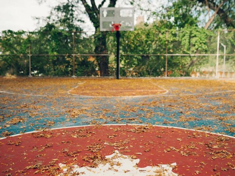
I guess the theme of this week (if there is one) would be framing. Pictures within a picture. Or it could be focus. What’s centered is what’s important. Anything else could be a distraction from the main thing. How do these images make you feel? Let us know in the comments below.
This first photo was taken by Jorge Gomez, @j.m._gomez on Instagram. I absolutely love the framing of this photo, peering through the plywood barricade gives the feeling of “through the looking glass” of what’s to come. This deep green wall is contrasted by the muted colors of the scenery behind it. A cloudy, white and blank sky looms over the building. The back of this Bronx building is perfectly centered in the cutout of the plywood and graffiti lines the inside of the plywood walls, showing it’s futile attempt to keep people out. As The Bronx continues to be redeveloped, this picture captures the tension between what’s to come and what’s already here. Keeping certain people out while others come in to stake their claim on this raw land with so much potential. One lone graffiti artist showing that we’re still here.

This next photo was taken by Frank Rivera, @franklyfrank and @quarterwater on Instagram. This photo gives me the feeling of a painted watercolor scene. The clouds in this sunset are light and fluffy, with varying hues of blue, pink and purple. There could have been a storm, or it was a particularly cloudy day. The buildings begin to pierce the sky halfway through the frame, with no uniformity in shape or color. You can’t help but be drawn to the center, red terra-cotta stucco building. It simply pops. The silver roofs keep your eyes center, almost keeping you from seeing the uniformity of the buildings they’re attached to. The trees on the bottom break up the monotony of these newer townhomes. My eyes are constantly being drawn to the sky and that center building, how about yours?

This last photo was taken by Jason Breton, @jason_breton on Instagram. There is so much to love in this photo. Before your eyes are drawn to the PMD logo, the small orange glow from the Vizio logo breaks through the dark room. The fluorescent lights illuminate the warehouse. Now, your eyes are drawn to the Port Morris Distillery logo, red, white, black and bold. Laid out are the tools of the trade, a craft distillery’s means of production in view. Barrels, hoses, labels, boxes and bottles for your viewing pleasure. A distiller at work, in motion in their domain, can be seen on the left. To the far right, someone waits for their friend, or a new drink or both. A single, half drunk drink sits on the ledge overlooking the workspace. One last barrel sits perfectly in the lower center part of the picture.
Check in next week for another Bronxscapes series.